Work that
sets the standard.
From web systems and digital experiences to packaging, visual identities and social media content — here you can see what our ideas look like when they become real projects.

Web solutions built
for real business.
Every project has a different goal: sales presentation, information, process automation, or a clearer path from visitor to inquiry.
Eurobelt
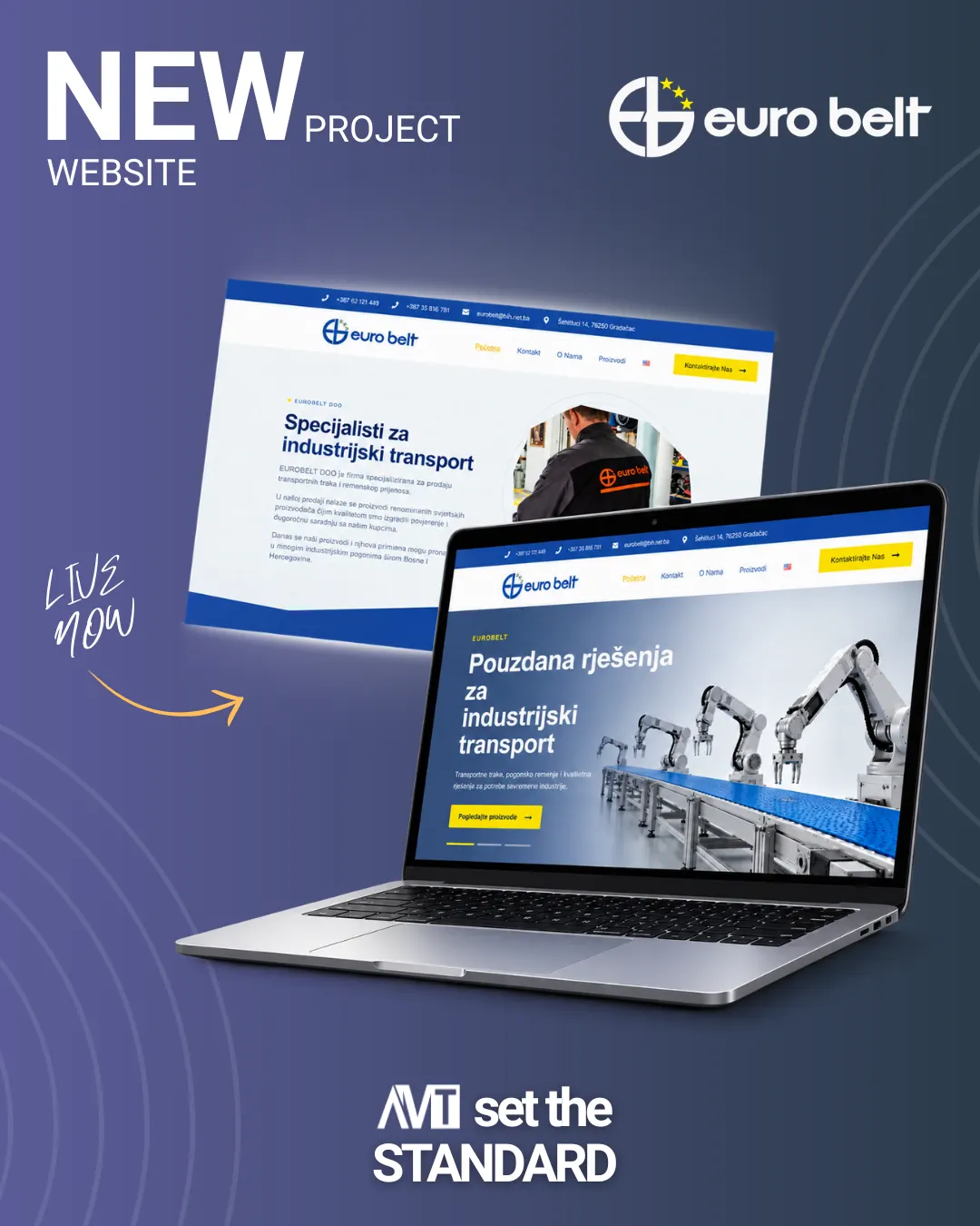
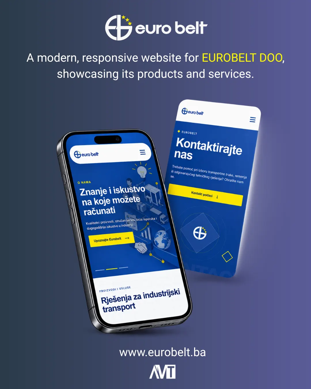
A presentation website for a company from Gradačac specializing in conveyor belts, belt drives and technical solutions for industrial customers.
We tailored the structure to a technical audience: the offer and solutions need to be understood quickly, without unnecessary marketing noise. The focus was placed on a clear presentation of conveyor belts and belt drives, the company’s technical expertise, and a simple path to direct contact for advice or a quote.
The visual system was intentionally kept clean and industrial so that product photos, machinery and concrete solutions remain the main carriers of the content.
Belaprom
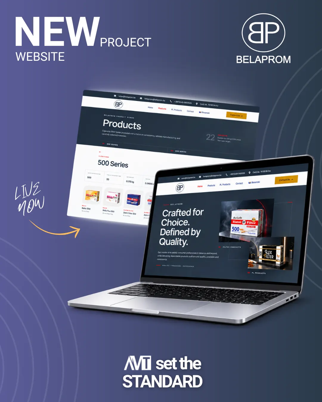
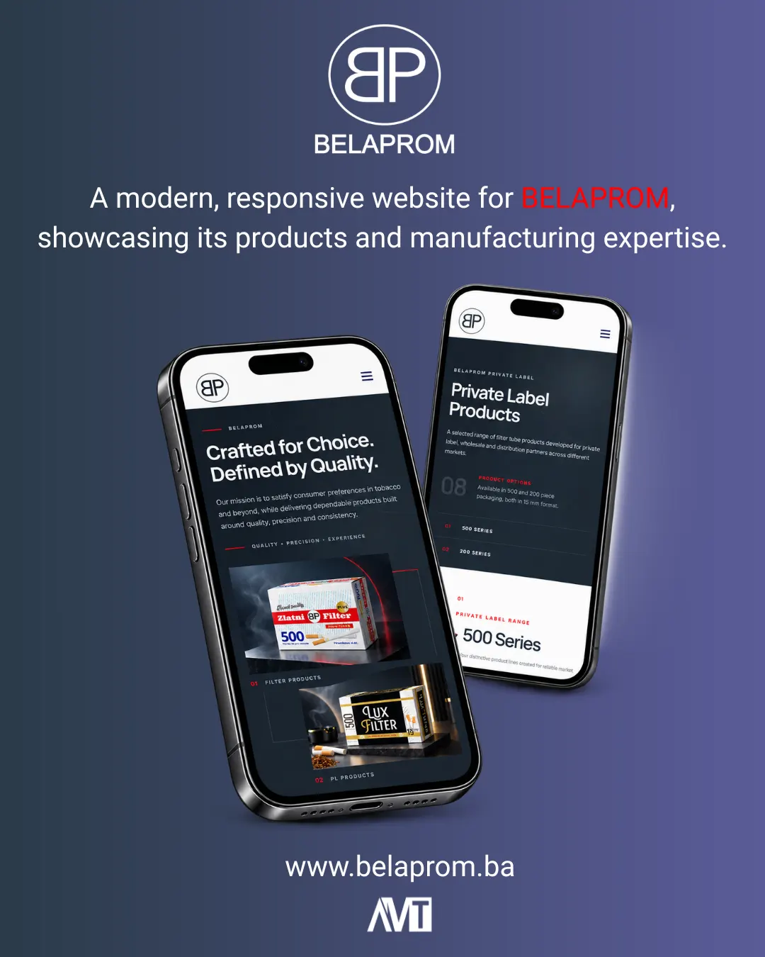
A corporate and manufacturing presentation for a European cigarette filter tube manufacturer, with a clear overview of the product range, specifications and private-label capabilities.
The biggest challenge was presenting a large number of similar products clearly. We therefore divided the catalog into 500-piece and 200-piece series and displayed key technical information for each item, such as filter format, transport packaging and other parameters relevant to B2B buyers.
We separated the private-label section so distributors and partners can immediately understand which options Belaprom can produce for their market, while the contact section leads directly to the sales team.
Belamionix
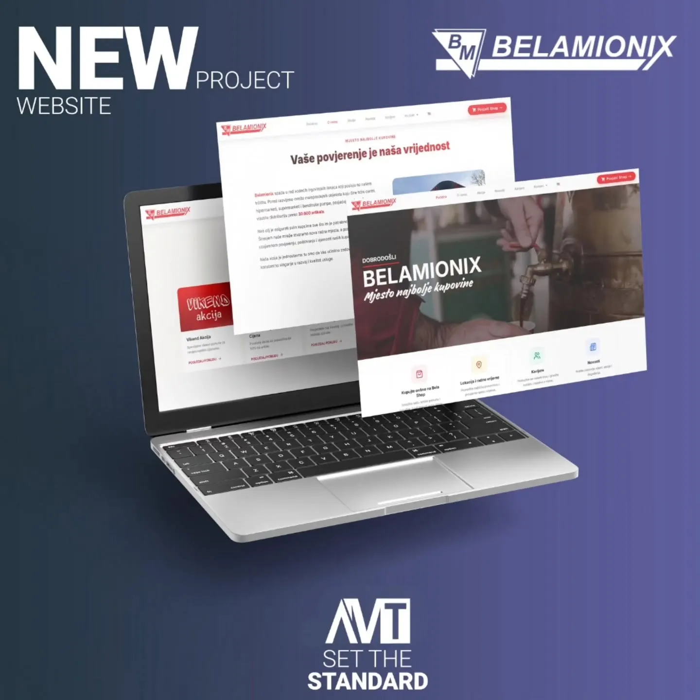
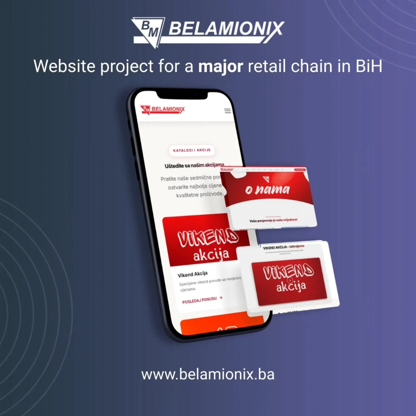
A website for one of the leading retail chains in Bosnia and Herzegovina, with a broad network of hypermarkets, supermarkets, shopping centers and gas stations.
The large amount of content required a structure in which visitors can quickly find what they came for: current offers, news, store locations and opening hours. The visual approach was built around dynamic retail content without sacrificing clarity on mobile devices.
Within the same business group, we also created the website for the sister company Belaprom ↗, so it was important to maintain the professional standard of the group while giving each brand its own digital character.
Bella Water
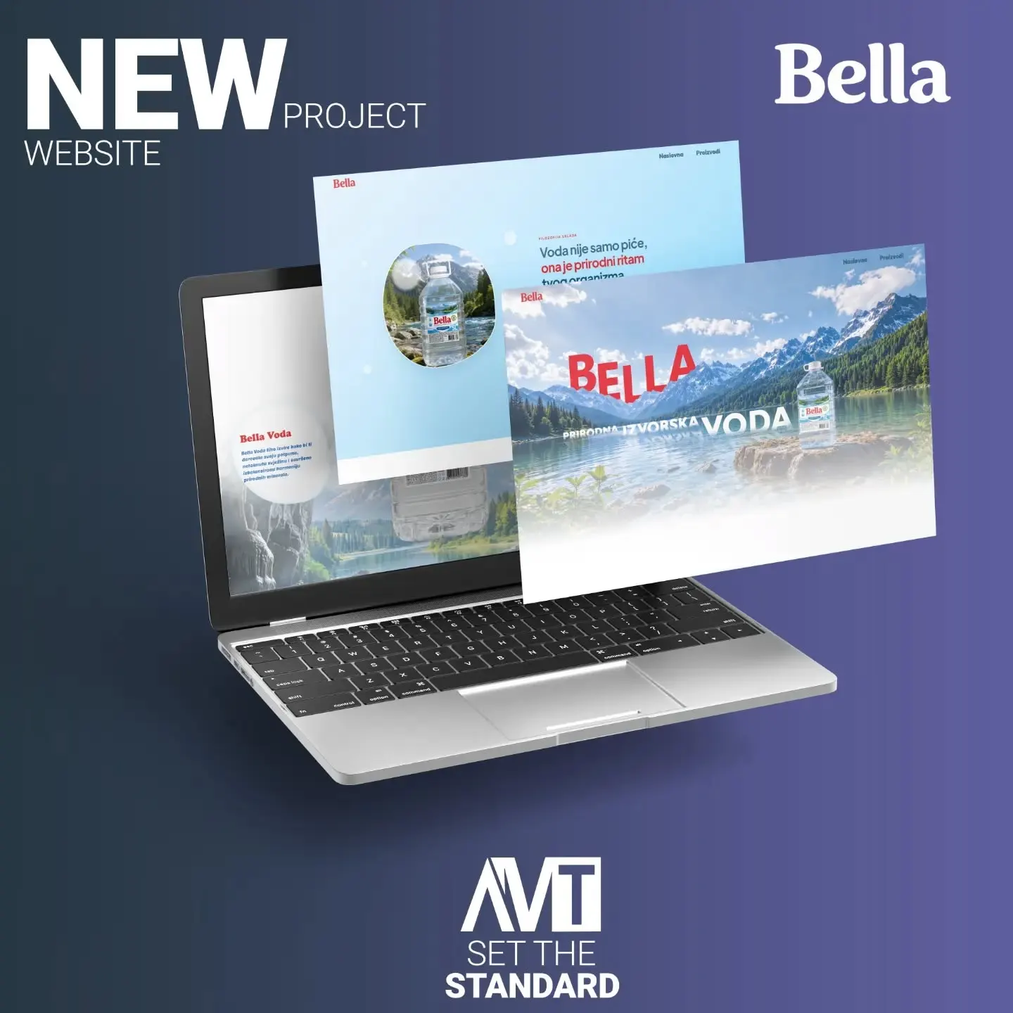
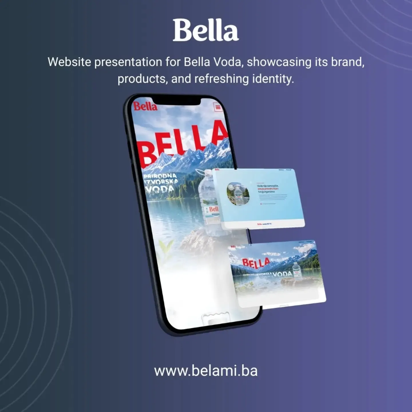
A product website for natural spring water, built so that the product, its origin and mineral composition become part of one visual story.
Instead of a traditional corporate website, the project was built as a digital presentation of a single product. Large visuals of nature and packaging accompany interactive information on sodium, calcium, magnesium, bicarbonates and pH value, keeping the technical information understandable and visually engaging.
We paid special attention to the scrolling rhythm: the hero introduces the product, then the user receives specific water characteristics, followed by the broader story of purity, hydration and the product itself.
K.NJ.O. B.K.S.
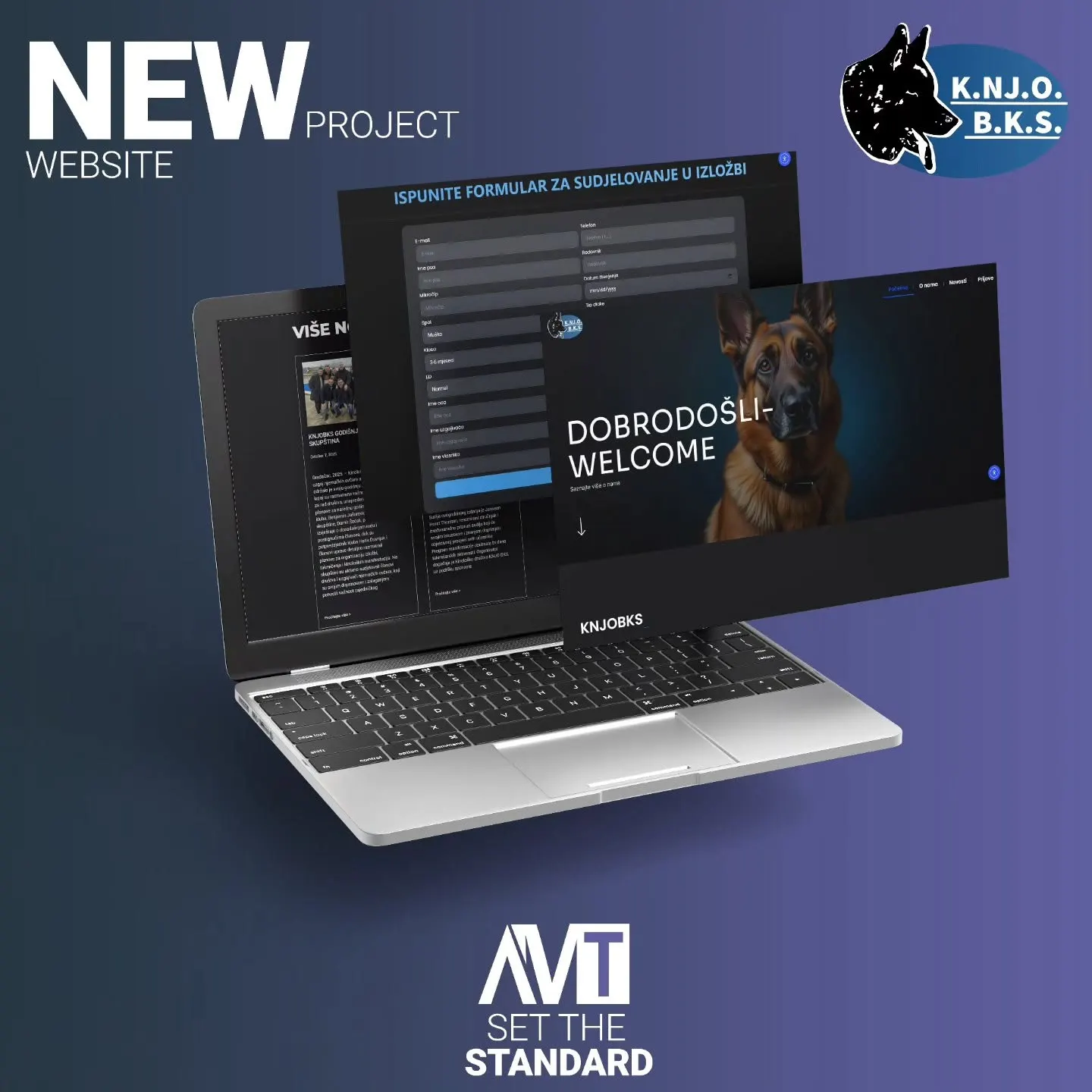
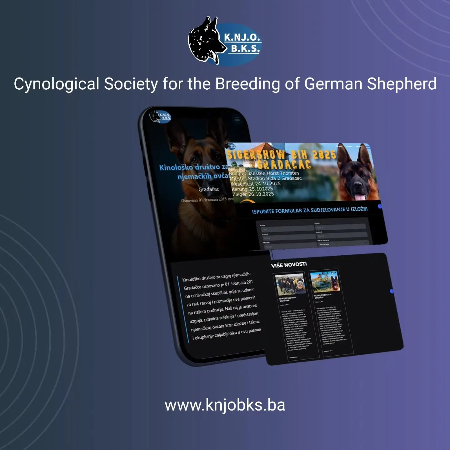
An informational website for a canine association, with a custom competition registration system and administrative automation.
The main part of the project was not just the website’s appearance, but solving a concrete client problem. Competitors register through a web form, the data is stored in a database, and a custom PHP script then converts it into a Word document ready for printing.
Dogs and competitors in the generated document are sorted by class and additional parameters used by the organizer during the competition. A process that was previously copied manually with pen and paper was turned into a significantly faster administrative workflow.
Lingua Translations
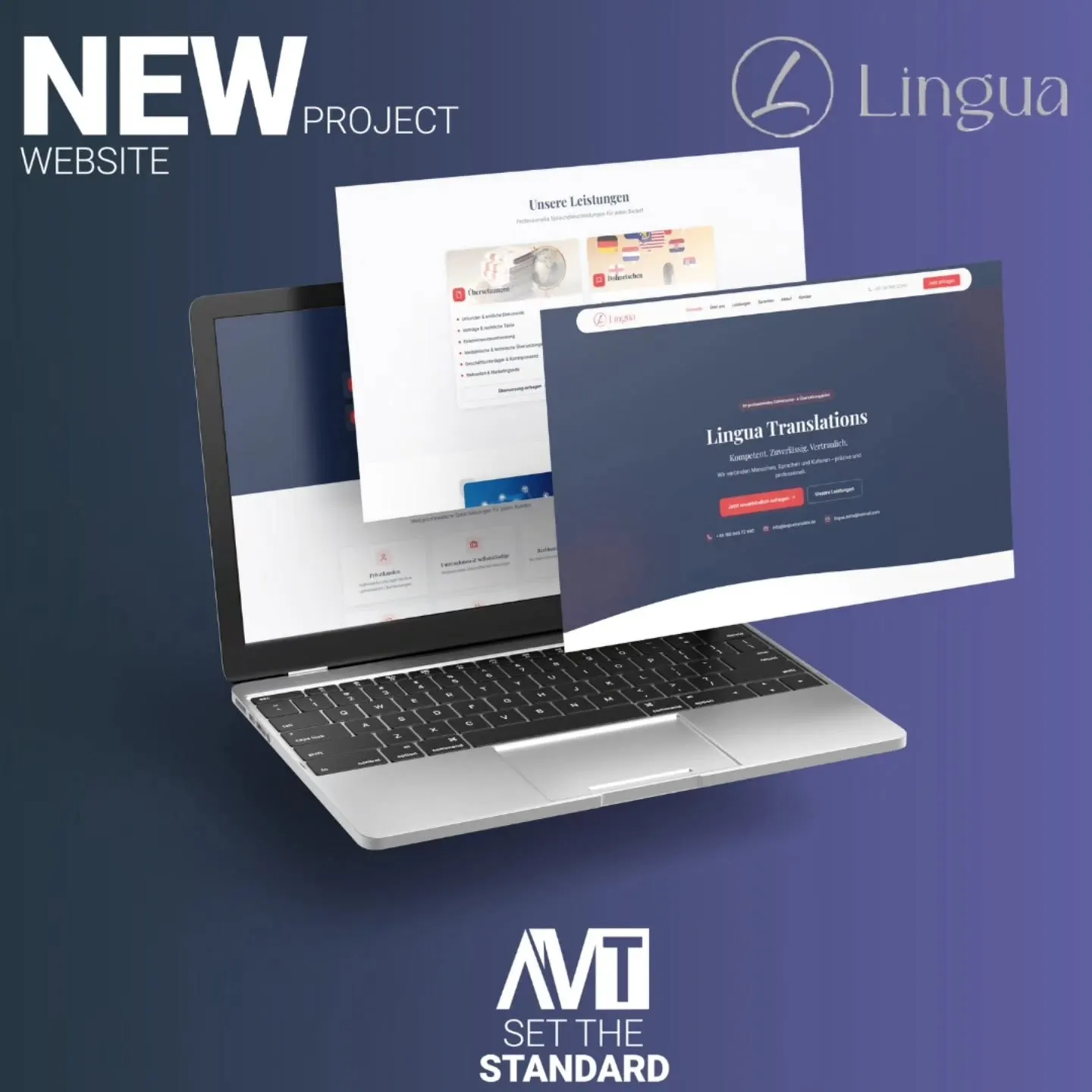
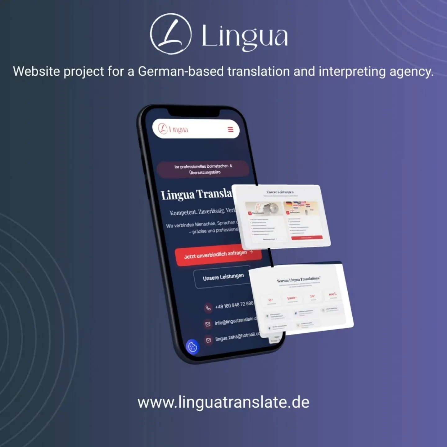
A website for a translation service in Germany offering translation and interpreting for private clients, companies, lawyers, courts and institutions.
We organized the content around two main user needs — written translation and interpreting — to keep the path to the right service short. Official documents, legal, medical and technical translations, as well as different types of interpreting, are clearly highlighted.
The website communicates support for more than 20 languages and years of experience, while keeping the most important conversion element simple: users quickly understand the service and can immediately request a quote or get in touch.
Packaging that has to work
on the shelf and in hand.
We do not design only the front of the package. We think about information hierarchy, product variants, print production, readability and how the entire line looks together.
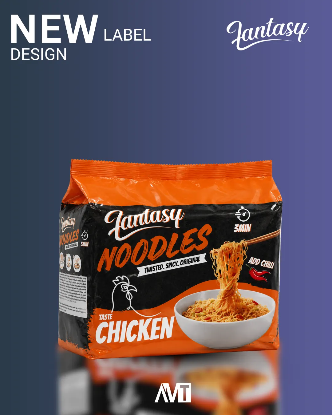
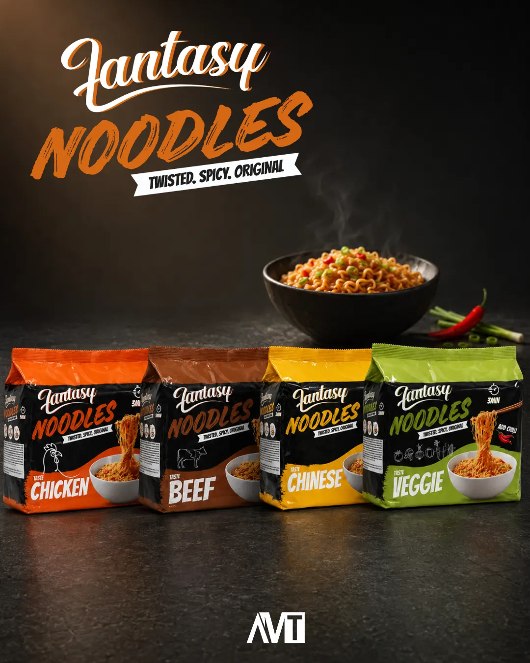
Fantasy Noodles
Packaging design created in Adobe Illustrator and Photoshop for a product available exclusively in Belamionix stores across Bosnia and Herzegovina.
The work included establishing a clear hierarchy for the product name and flavor, preparing the photographic part of the packaging and organizing mandatory information so the front remains strong and the back easy to read. Final files were prepared as a scalable system for future product variants and print production.
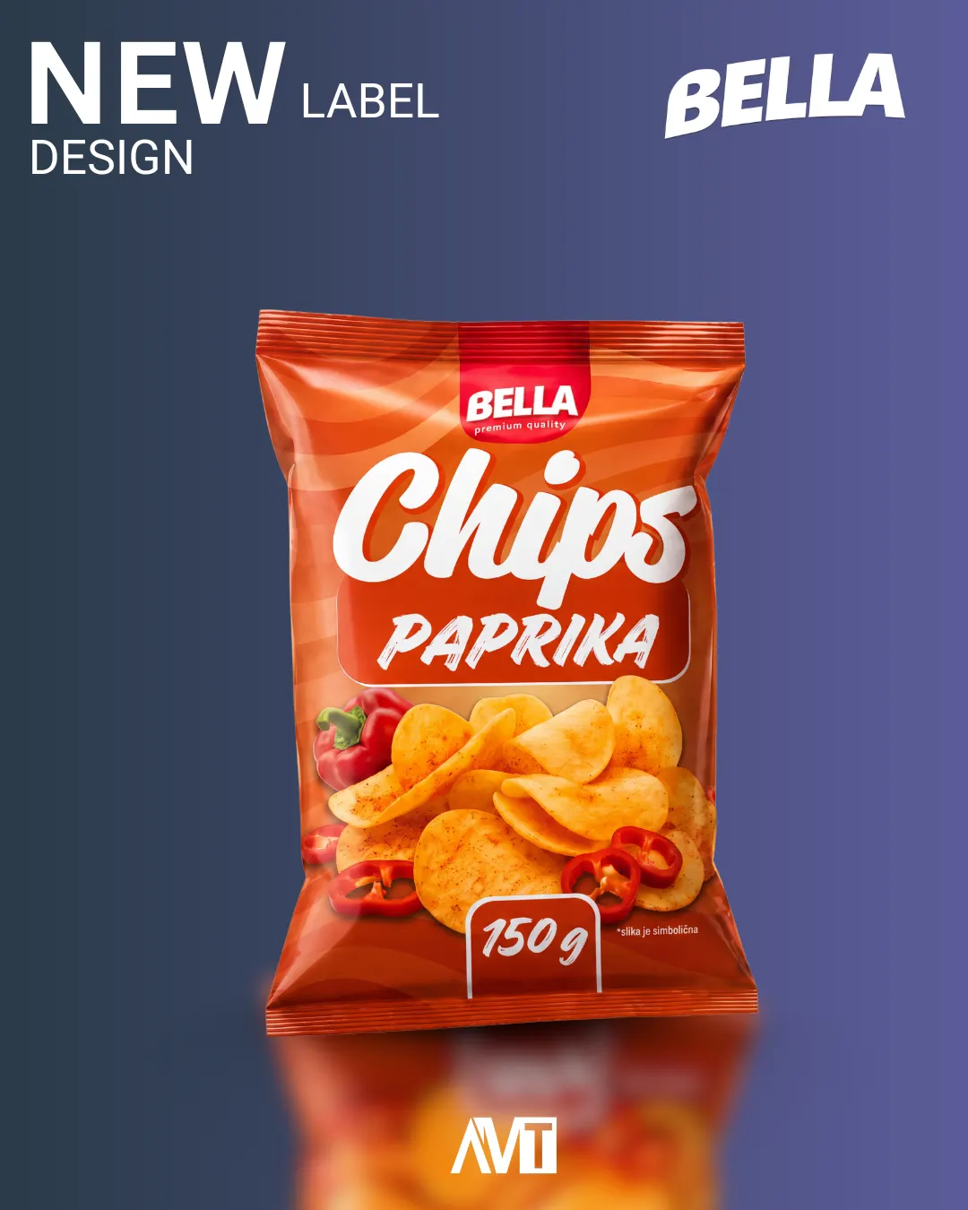
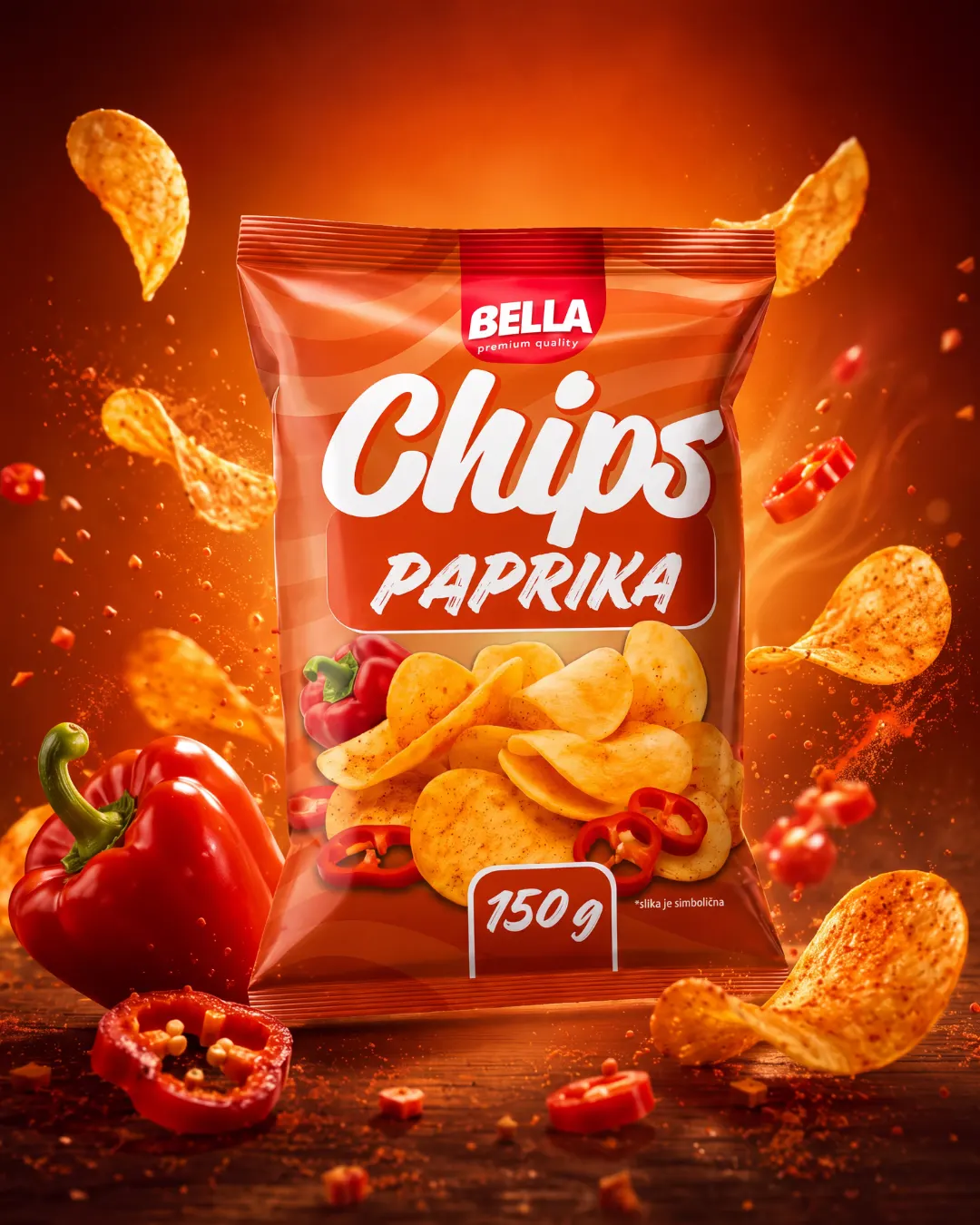
Bella Chips
A packaging system developed for multiple chip flavors, including salted and paprika, along with a related popcorn line. The paprika variant is shown here.
Photoshop and Illustrator were used for product composition, hero visual editing and final packaging graphics, with additional upscaling tools used to improve the source material. The system was designed so each flavor is clearly differentiated while the entire line remains recognizably Bella.
The products are available exclusively in Belamionix stores.
Dream Coffee
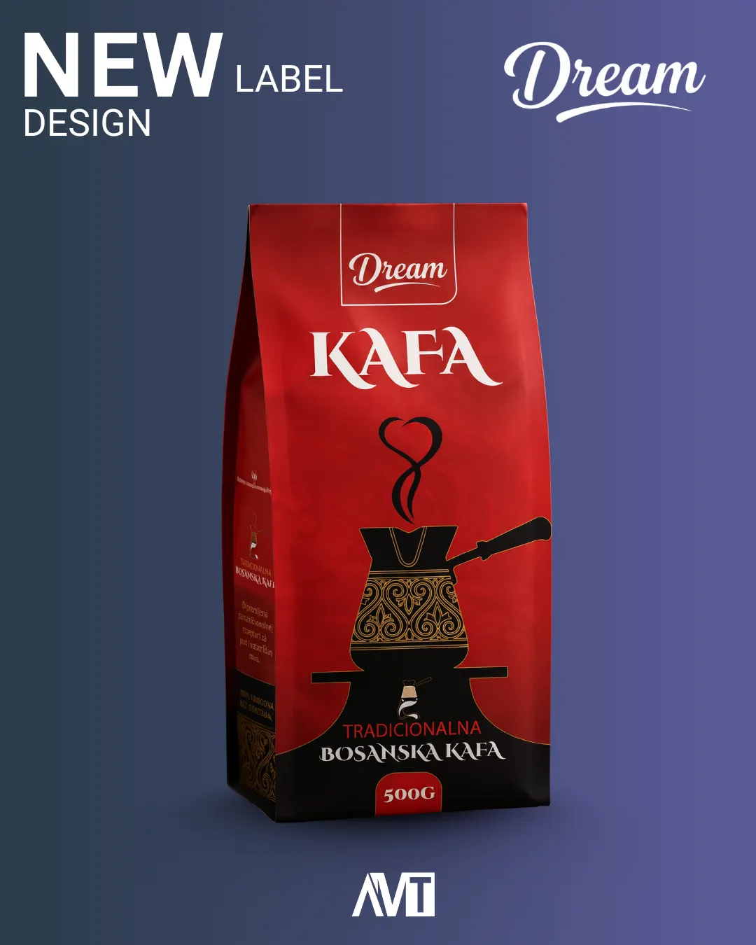
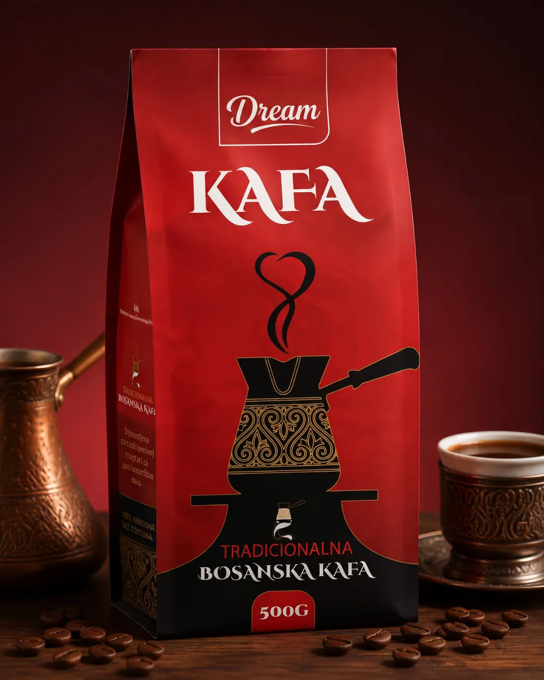
Coffee packaging designed in Illustrator and Photoshop, with a focus on a clear premium product presentation and strong shelf readability.
For the coffee packaging, it was important to find a balance between the warmth of the product and a sufficiently modern look. The typographic hierarchy, brand name, key information and product photography were arranged so the package remains easy to recognize even from a distance.
Active Foam
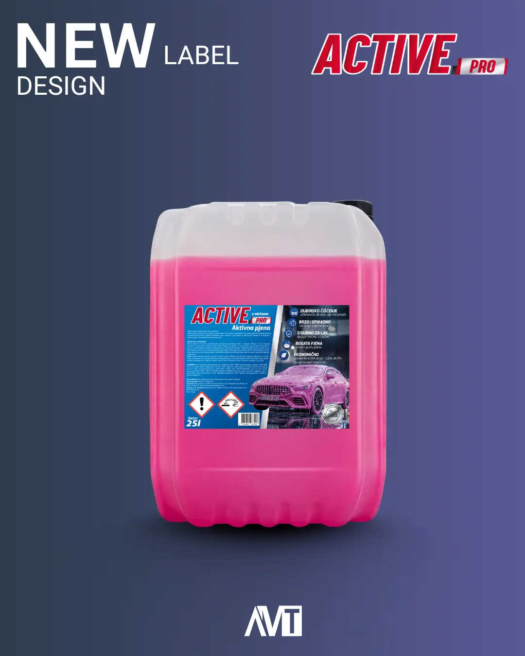
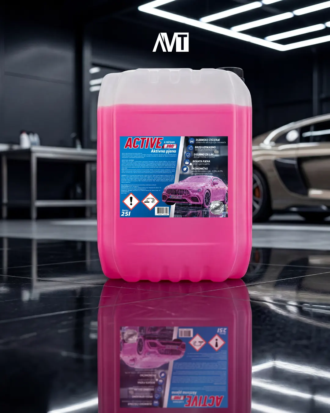
Design for a product sold at numerous gas stations and retail stores across Bosnia and Herzegovina, created in Photoshop and Illustrator.
The visual direction had to work in an auto-care environment: strong recognition, quick identification of purpose and a sufficiently technical feel without overloading the packaging. We prepared the final label design and visual product presentation.
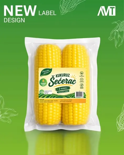
Sweet Corn
A product design that reached the shelves of several retail chains in Bosnia and Herzegovina, including Bingo, Amko and Crvena Jabuka.
The packaging was developed as a market-ready product, so beyond visual impact, a readable name, clear category recognition and a flexible system for future products under the same brand were essential.
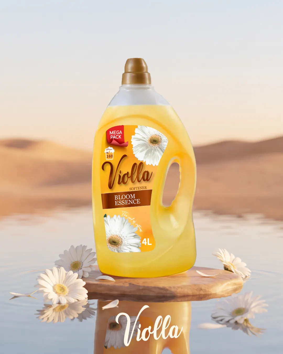
Violla Fabric Softener 4L
A visual solution for a 4-liter fabric softener sold in multiple retail stores across Bosnia and Herzegovina.
With a large package, the main challenge was keeping the label readable even when the product is placed on lower shelves. The name, key benefit and visual motif were therefore arranged in a clear hierarchy that works well both on the physical product and in online promotion.
An identity that remains
recognizable everywhere.
A logo is the beginning of a system, not the end. Colors, typography, proportions and usage rules need to work on screen, packaging, jerseys, social posts and print.
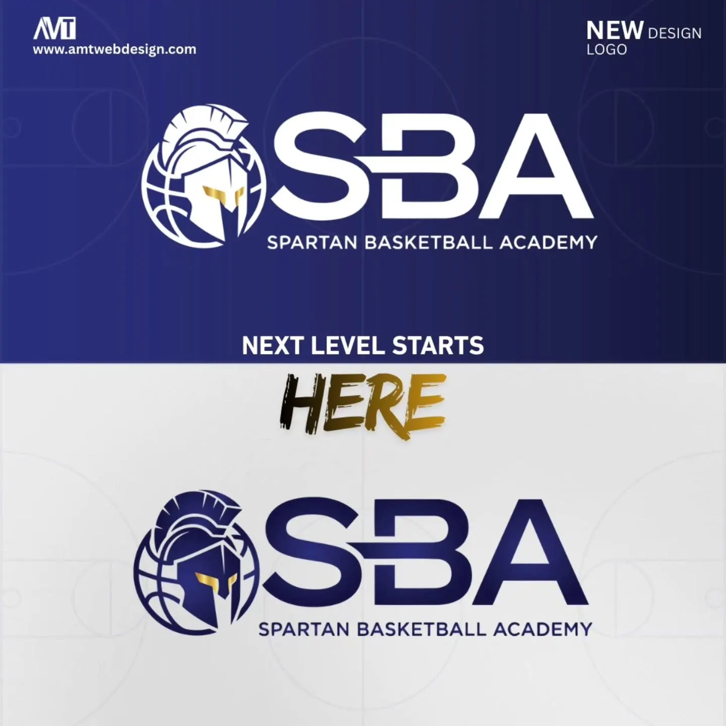
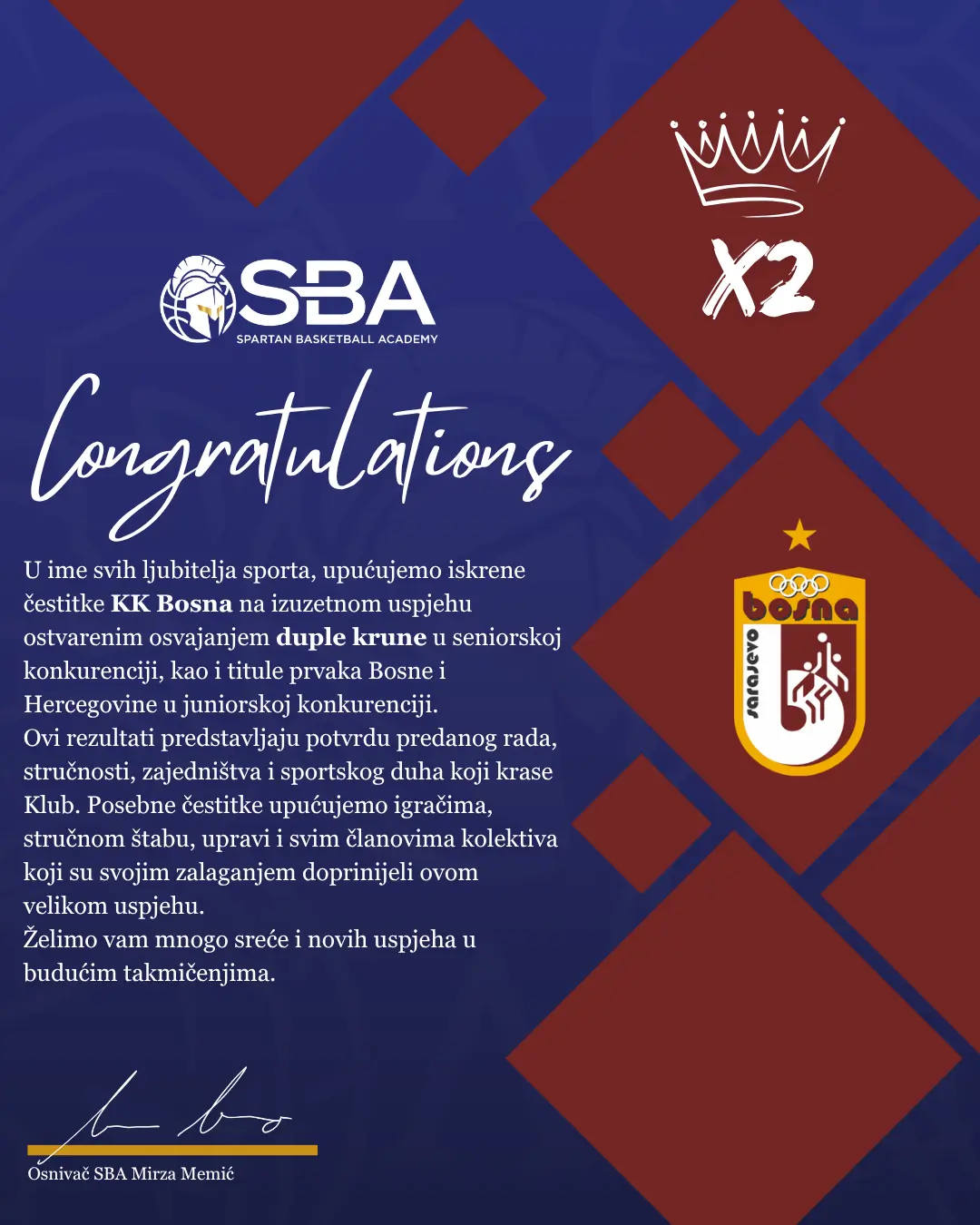
Spartan Basketball Academy
A complete redesign of the previous visual identity for a basketball academy from Tuzla, developed in direct collaboration with the client.
Together with the client, we defined the direction for colors, typography and the symbol itself, while the final logo was created in Adobe Illustrator as a vector system. The redesign had to preserve its sports energy while remaining clean enough for jerseys, social media, video graphics and printed materials.
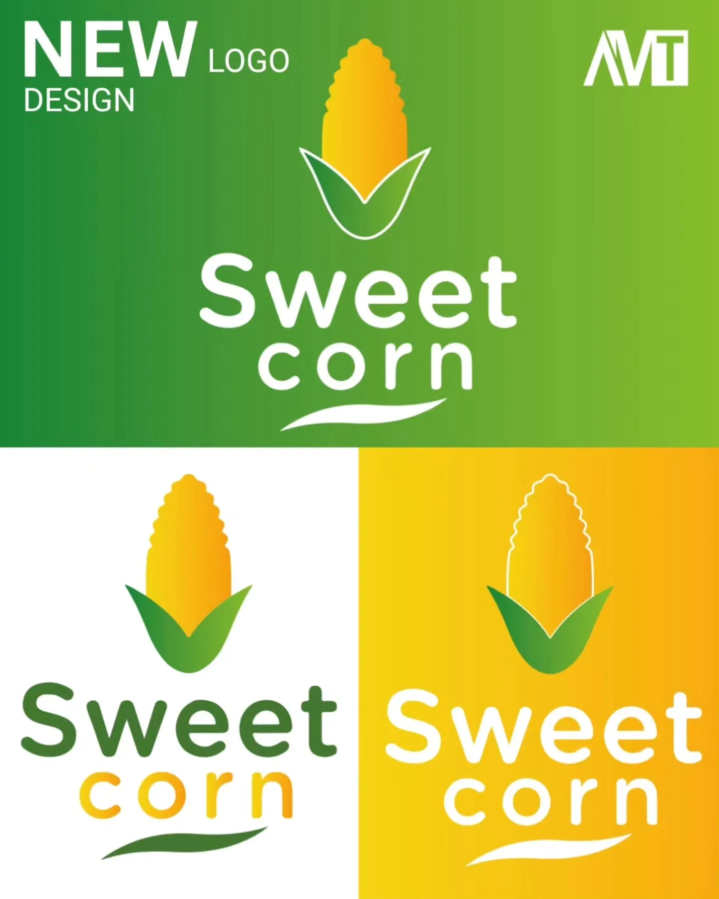
Sweet Corn
A completely new logo and visual identity for a new market brand, developed to work across packaging and a future product portfolio.
The identity was designed for an FMCG environment from the start: it had to remain readable on packaging, distinctive enough on the shelf and easy to apply across different formats. The brand’s products are available in chains such as Bingo, Amko i Crvena Jabuka, as well as other retail stores.

Ground 0
Logo design for Ground 0, a platform dedicated to basketball and NBA content. The project focused exclusively on creating a recognizable mark for their digital presence.
The goal was to create a logo that retains the energy of basketball while staying clean and legible for profile images, posts, sports graphics and different digital formats. Special attention was given to the recognizability of the mark and its usability at smaller sizes.
Content that feels like
part of the same brand.
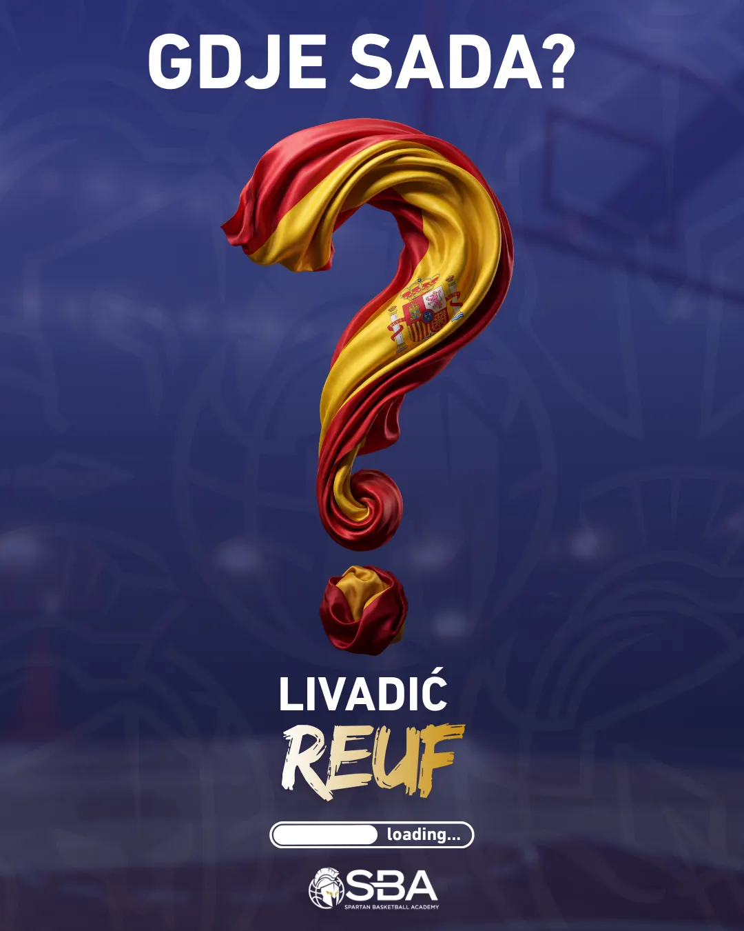
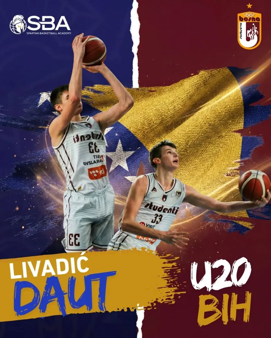
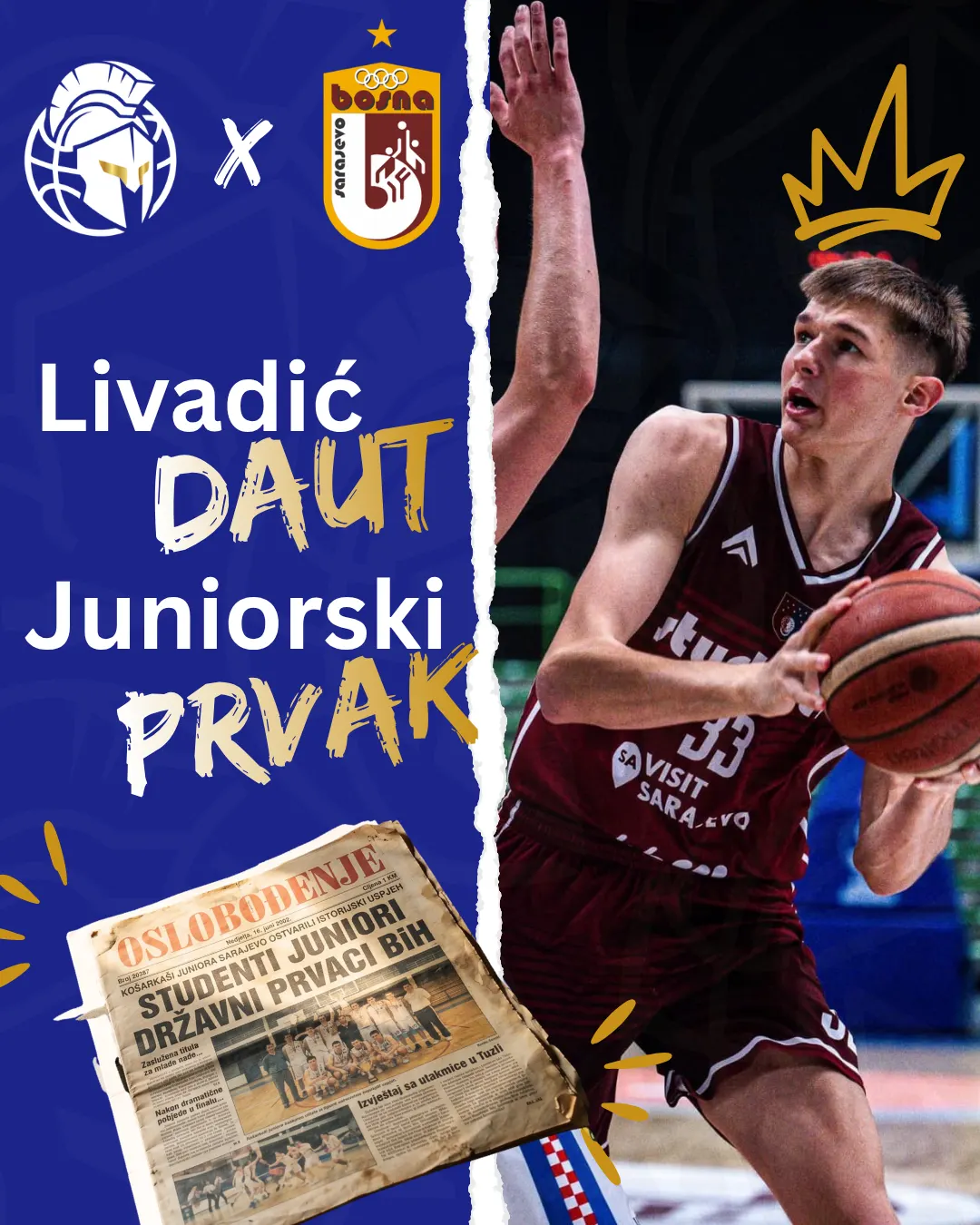
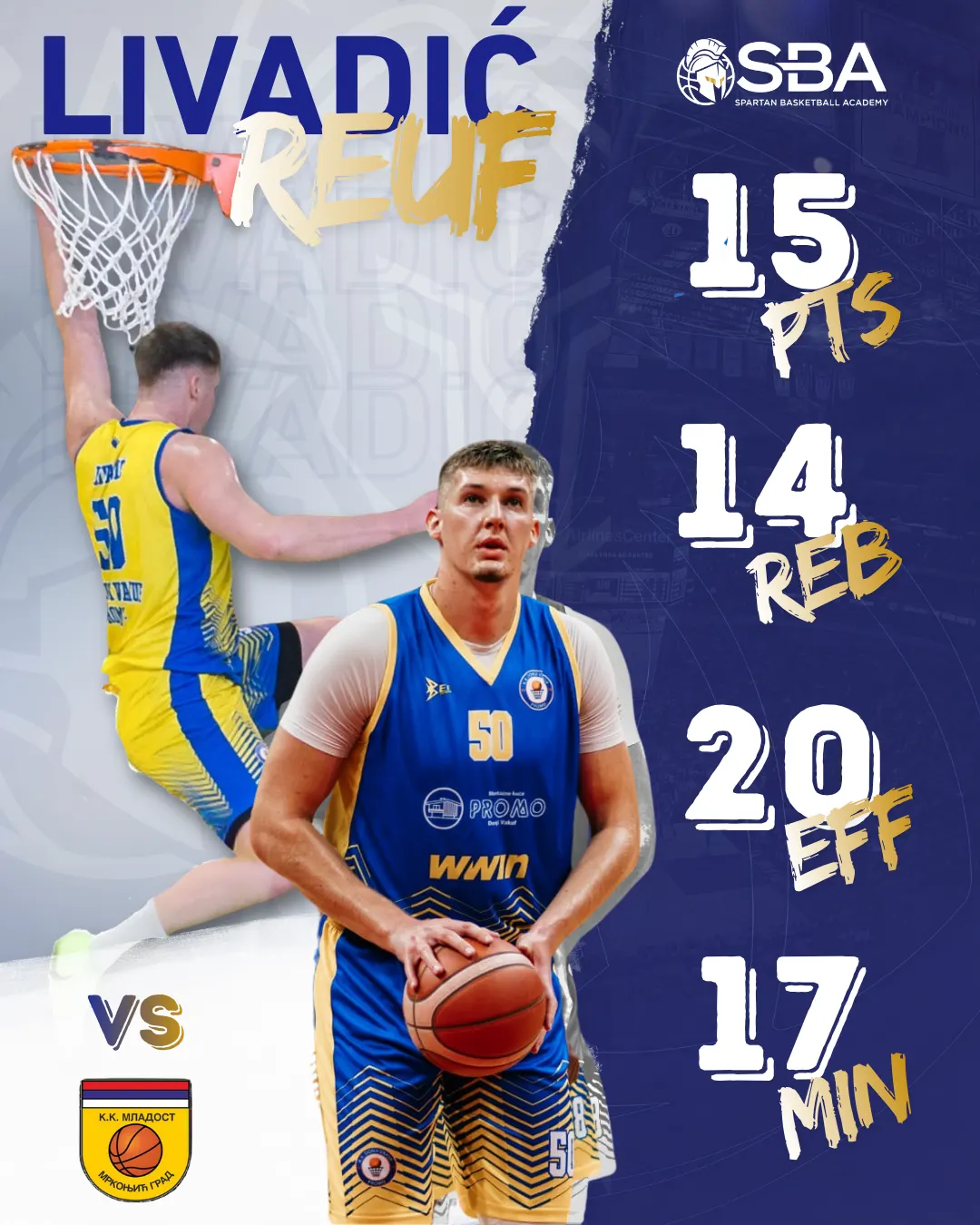
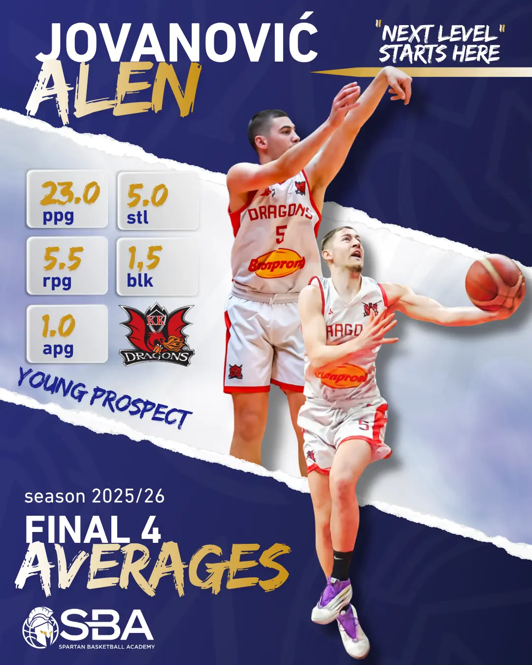
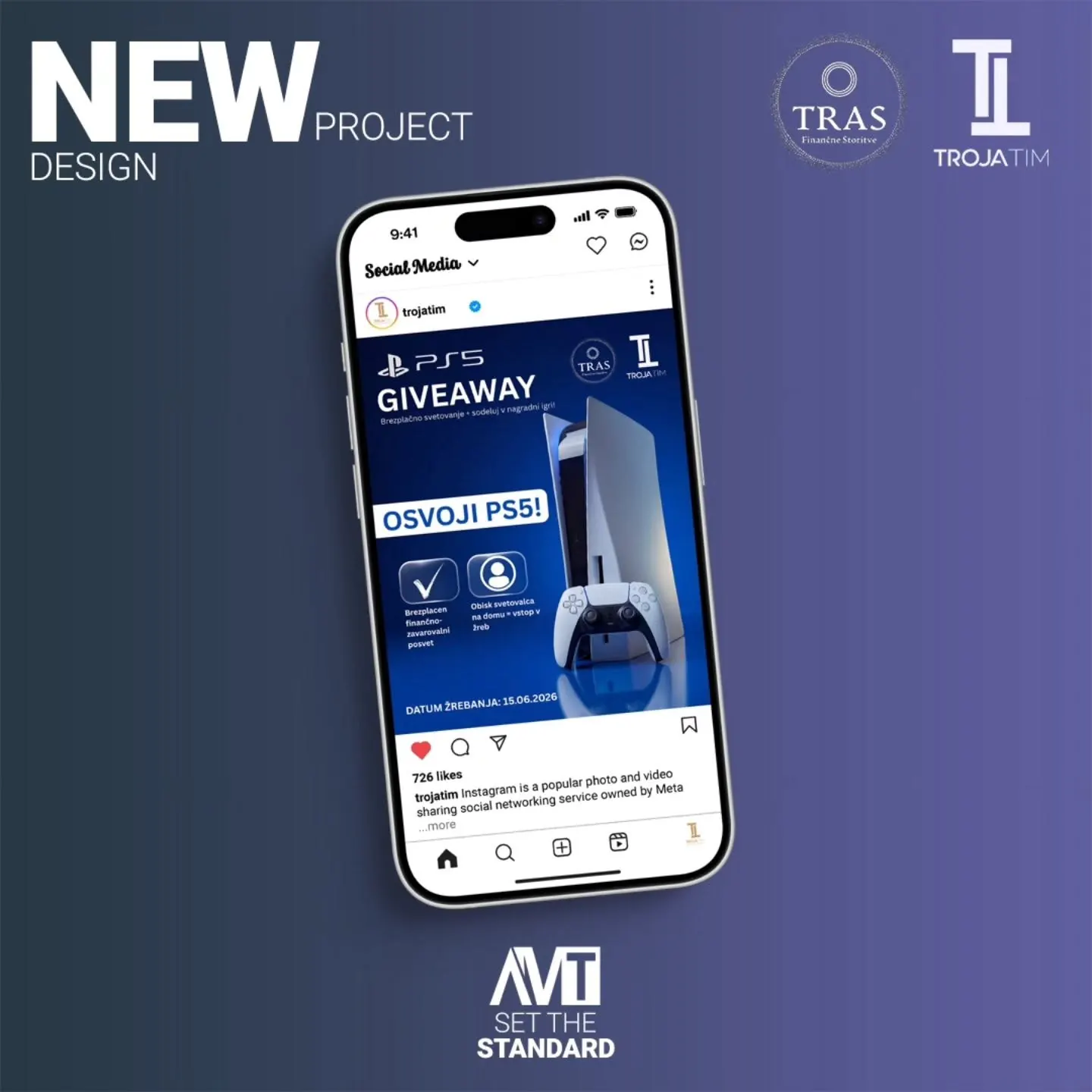
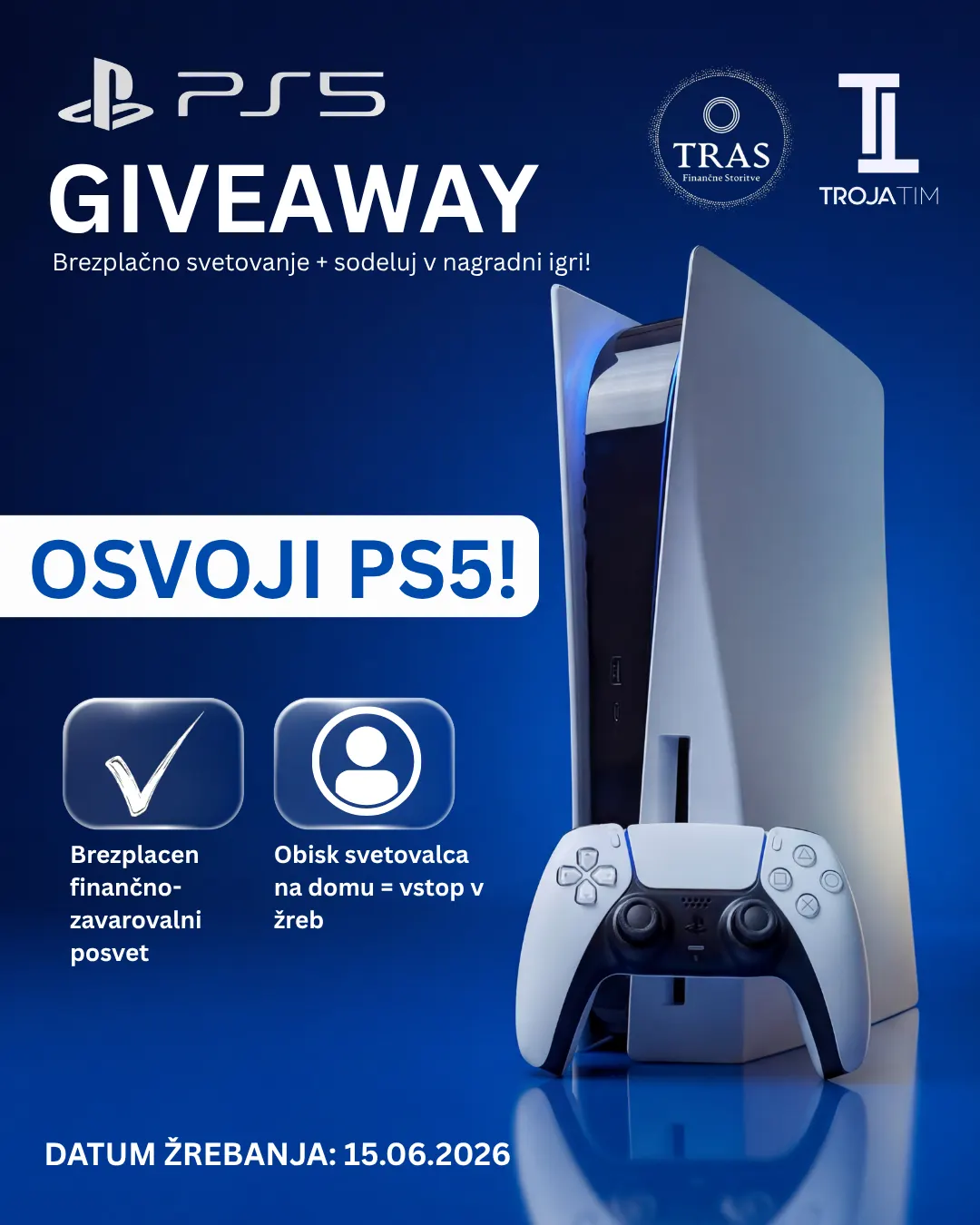
From regular posts to campaigns and video highlights, the goal is to give the profile rhythm, a recognizable style and a reason for the audience to stay.